Let us be honest for a moment. When you are learning to code or even doing it professionally, you spend an astonishing amount of time just staring at text. Lines and lines of monospaced characters in your editor. For years, I never gave much thought to the font I was using. The default one in Visual Studio Code or whatever IDE I had was “fine.” It was just the vessel for the code, not something that could actively help or hinder me.
That changed when I discovered FiraCode. At first, I saw it as a mere aesthetic tweak—a way to make my editor look cooler, like those sleek setups developers post on Twitter. But after using it for a single afternoon, I realized it was not about style at all. It was about clarity. It was one of those small, five-minute changes that, years later, I still consider one of the best productivity boosts I have ever applied to my workflow. Today, I want to walk you through what FiraCode is, why it works so well, and how you can easily get it set up. This is not just for experts; it is for anyone who writes code and wants it to be easier on the eyes and the brain.
What Exactly is FiraCode?
In simple terms, FiraCode is a free, open-source font designed specifically for writing code. It falls under the category of “monospaced” fonts. You have probably heard that term before. It means every character, whether a skinny ‘i’ or a fat ‘m’, takes up the exact same horizontal space. This is crucial for coding because it keeps your indentation and alignment perfectly in place, making the structure of your code visually predictable.
But FiraCode is not just another monospaced font like Courier New. Its secret weapon, and the reason it has garnered a cult-like following among developers, is its extensive use of programming ligatures.
Now, “ligature” might sound like a complex typography term, but the concept is simple. In traditional typography, a ligature merges two or more characters into a single, combined glyph to improve readability and flow. The most common example you might see in fancy books is the “fi” ligature, where the dot of the ‘i’ elegantly connects with the hook of the ‘f’.
FiraCode applies this ancient typesetting principle to modern programming. It takes sequences of characters that form common programming operators and turns them into a single, unified symbol.
The Magic of Ligatures: From Confusing Symbols to Clear Concepts
This is best understood by seeing it. Let us look at some examples.
-
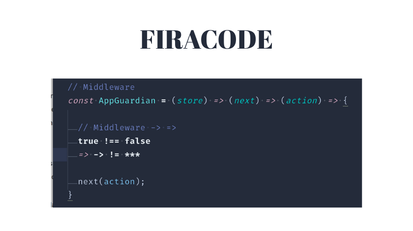
The arrow function in JavaScript: You write
=>. With a standard font, this is two separate characters: an equals sign and a greater-than sign. Your brain has to parse them together. With FiraCode,=>becomes a single, smooth, right-pointing arrow: ⇒. It is no longer two symbols; it is one clear icon representing “arrow.” -
The comparison operators:
!=(not equal) becomes ≠,>=becomes ≥, and<=becomes ≤. These are intuitive mathematical symbols we learned in school, yet in most code editors, we are stuck typing them as clumsy two-character approximations. -
The triple equals in JavaScript (
===), which is three separate characters, transforms into a clean, triple-barred equals sign. -
Other common sequences like
->,//,/*,*/, and even!=are all elegantly combined.
The first time you see this, it might feel a little strange. It looks almost too neat. But within minutes, the benefit becomes crystal clear. Your brain stops doing the extra work of visually grouping discrete characters. The symbol is the concept. This reduces what psychologists call cognitive load—the mental effort required to process information. When you are scanning hundreds of lines of code, these tiny reductions in effort add up to significantly less mental fatigue.
Beyond the Pretty Face: The Real, Practical Benefits
So, it looks cool. But does it actually make you a better coder? The answer, in my experience and that of many others, is a resounding yes, for several concrete reasons.
1. It Eliminates Ambiguity. Have you ever misread a != for a = in a quick glance? Or struggled to see the difference between | (a pipe) and l (a lowercase L) in certain fonts? Ligatures make operators distinct and unambiguous. The “not equals” symbol (≠) looks nothing like a single equals sign (=). This can literally help you spot bugs faster.
2. It Dramatically Improves Readability. Code is not a novel; it is a dense, symbolic language. Anything that helps you parse it faster is a win. By turning clunky character sequences into natural symbols, FiraCode makes the logical flow of your code more visually apparent. Complex lines with multiple operators become easier to break down visually.
3. It Reduces Eye Strain. This was the most unexpected benefit for me. Before FiraCode, after a long coding session, I would feel that tired, gritty sensation in my eyes. I never connected it to the font. But the constant, slight effort of focusing on and deciphering tiny, disconnected symbols is taxing. FiraCode’s clean, unified glyphs create a smoother reading rhythm. The font itself is also very well-designed, with a pleasant height and clear character differentiation (zero vs. capital O, one vs. lowercase l).
4. It Makes Your Code Feel More “Designed.” Okay, this one is about aesthetics, but it matters. Enjoying the tool you work in makes the work more enjoyable. Opening your editor to a clean, beautiful typeface can provide a small but genuine motivational boost. It makes your workspace feel professional and cared for.
Getting Started: How to Install and Use FiraCode
The best part about FiraCode is that it is completely free and straightforward to install. Here is a step-by-step guide.
Step 1: Download the Font
Head to the official FiraCode GitHub repository. You can find it by simply searching “FiraCode GitHub.” Go to the “Releases” section and download the latest version. You will get a ZIP file containing various font files (like FiraCode-Regular.ttf).
Step 2: Install the Font on Your Operating System
-
Windows: Unzip the file, right-click on the
.ttffiles (you can select multiple), and choose “Install.” -
macOS: Unzip, double-click the
.ttffiles, and click “Install Font” in the Font Book app that opens. -
Linux: The process varies by distribution, but typically involves moving the
.ttffiles to your~/.fontsdirectory and runningfc-cache -f -v.
Step 3: Enable it in Your Code Editor
-
Visual Studio Code: Open Settings (Ctrl+, or Cmd+,). Search for “Font Family.” In the settings.json, add or modify the line:
"editor.fontFamily": "'Fira Code', 'Consolas', 'monospace'". Then, search for “ligatures” and ensure"editor.fontLigatures": trueis set. -
JetBrains (IntelliJ IDEA, PyCharm, WebStorm, etc.): Go to File > Settings > Editor > Font. Choose ‘Fira Code’ from the font list. Then, you must check the box that says “Enable font ligatures.” This is a crucial step!
-
Other Editors (Sublime Text, Atom, etc.): The process is similar—find the font settings in preferences and set the font family to ‘Fira Code’. Most modern editors support ligatures by default once the font is applied.
A Quick Troubleshooting Tip: If you have followed the steps but the ligatures are not appearing, the number one culprit is that ligatures are not enabled in your editor’s settings. Double-check that specific setting. The second culprit could be a terminal or environment that does not support ligatures at all, but all major dedicated code editors do.
Is FiraCode the Only Option? A Glance at Alternatives
FiraCode popularized ligatures, but it is not the only font that uses them. It is important to know about alternatives, as font choice is deeply personal.
-
Cascadia Code: Developed by Microsoft and bundled with Windows Terminal. It also has great ligatures and is designed specifically for terminal and coding use. Some find it slightly more spacious than FiraCode.
-
JetBrains Mono: Created by the makers of IntelliJ IDEA. It is fantastic, with a focus on letter shape clarity to reduce fatigue. Its ligatures are more subtle than FiraCode’s.
-
Iosevka: A incredibly versatile font that is slimmer by default, allowing you to see more code on a line. It is highly customizable, letting you build your own variant with specific ligatures and widths.
My personal journey went from FiraCode to trying all of these. I eventually circled back to FiraCode because its balance of weight, ligature design, and overall readability just clicked for me. But I know brilliant developers who swear by each of the others. The best advice is to try FiraCode for a week or two, then try another for comparison. Your eyes will tell you which one feels like home.
Conclusion: A Small Investment with a Lasting Return
In the grand scheme of your developer toolkit, a font seems trivial. It is not a new framework, a powerful debugger, or a complex DevOps pipeline. Yet, its impact is constant and pervasive. You look at it for every single minute of your coding day.
Adopting FiraCode (or a font like it) is a five-minute investment that pays dividends in reduced eye strain, improved readability, and a small but meaningful boost to your daily coding joy. It removes a subtle layer of friction you might not have even known was there. It is a tool that does not help you write code faster in the sense of typing speed, but it helps you read and understand code faster, which is arguably more important.
So, give it a shot. Download it, install it, and use it for your next project. You might just find that this tiny change makes staring at a screen full of symbols a noticeably more pleasant—and productive—experience.
Frequently Asked Questions (FAQ)
Q1: Are programming ligatures just for show? Do they actually help?
A: They are far more than cosmetic. Ligatures transform multi-character operators into single, intuitive symbols (like turning != into ≠). This reduces the cognitive load on your brain when scanning code, leading to faster comprehension, less ambiguity, and reduced eye strain over long periods.
Q2: Will FiraCode work in my terminal/command prompt?
A: It depends. Most modern terminals like Windows Terminal, iTerm2 on macOS, and GNOME Terminal on Linux support ligatures if the font is installed and selected in the terminal’s settings. However, the classic Windows Command Prompt and some older terminals do not support ligatures and will show the original separate characters.
Q3: I installed FiraCode, but the ligatures aren’t showing in my editor. What’s wrong?
A: The most common issue is that ligatures are not explicitly enabled in your editor’s settings. Simply setting the font is not enough. Go into your editor’s settings (for example, in VS Code search for “font ligatures,” in JetBrains check the “Enable font ligatures” box) and ensure the feature is turned on.
Q4: Is FiraCode only for certain programming languages?
A: Not at all. FiraCode’s ligatures are designed for common operators used across many languages, including JavaScript, Python, Java, C++, C#, and more. Whether you are writing => in JavaScript, != in Python, or -> in C++, the appropriate ligature will appear.
Q5: Can I use FiraCode for regular writing (like in Word or Google Docs)?
A: You can, but it is not ideal. As a monospaced font, it is designed for code where alignment is key. For prose writing, proportional fonts (where characters have different widths) like Times New Roman, Arial, or Calibri are much more readable and aesthetically pleasing.
Read Also: Mihomo Party Lazy Config Guide 2024: Stress-Free Setup for Beginners | Clash Verge Tutorial